The Power of Data Visualisation in Data Science
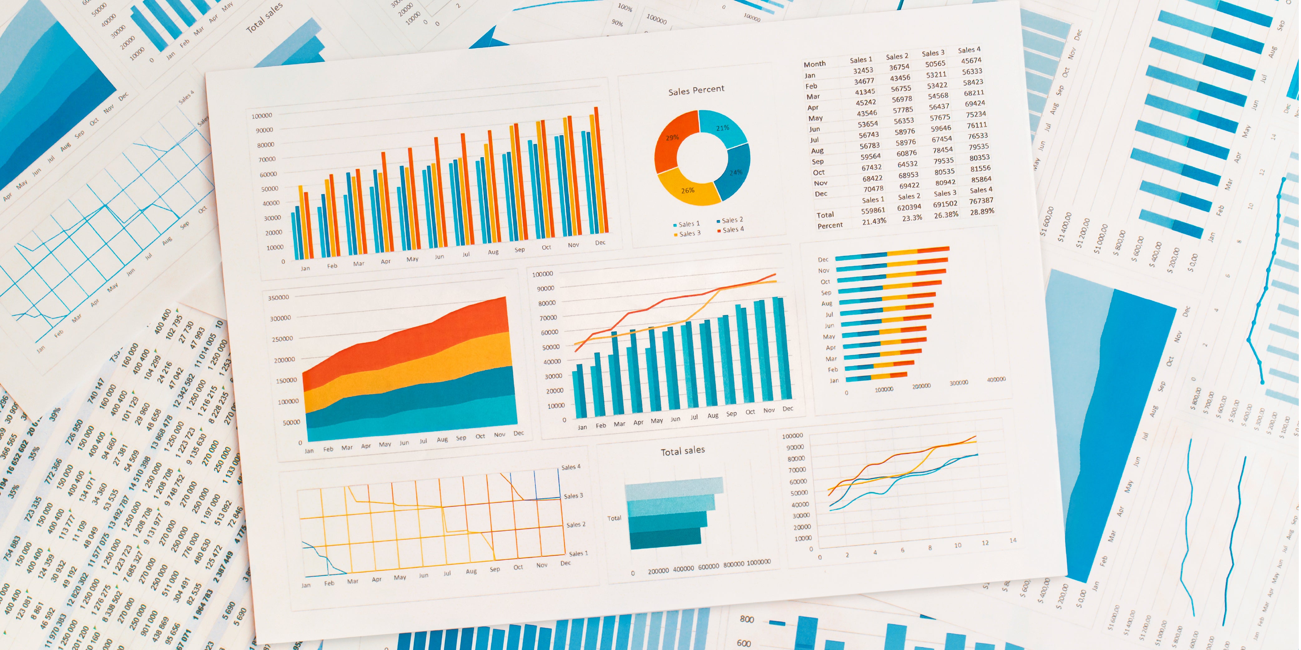
Every day, we generate a staggering amount of data - 2.5 quintillion bytes, to be exact. This digital treasure trove holds the power to revolutionise our daily lives, from optimising healthcare systems to predicting consumer trends. But, without a clear-cut approach to decipher this information, it remains a bewildering mess of numbers and statistics.
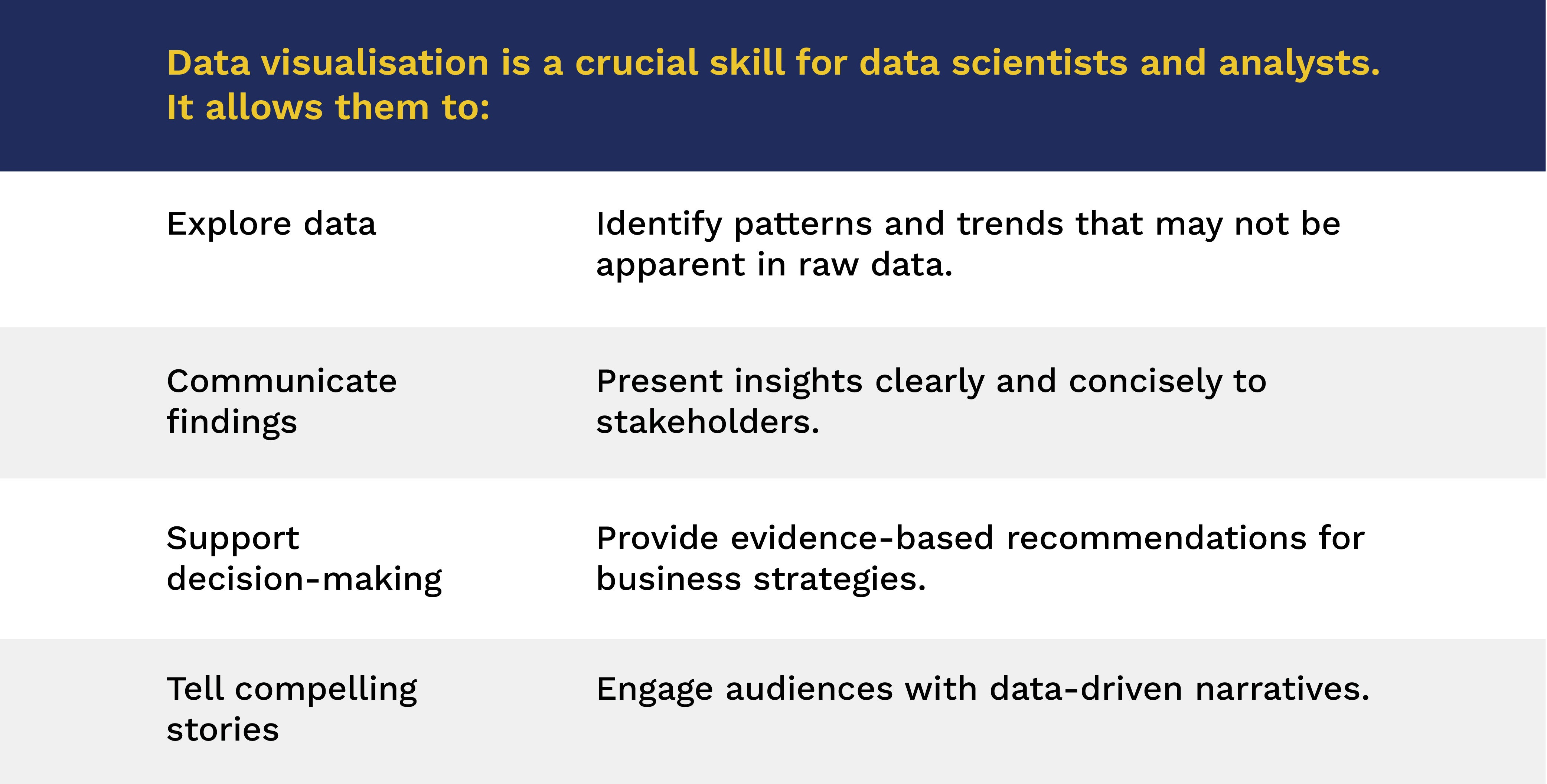
This is where the magic of data visualisation comes in. This core subject in our 100% online Master in Data Science programme is essential for those seeking to excel in data analytics, as it equips professionals with the ability to interpret complex information, uncover valuable insights, and create narratives that drive action.
Understanding Data Visualisation
Why Do We Need Data Visualisation?
The human brain is wired to process visual information more efficiently than text or numbers. Data visualisation leverages this by presenting data in a way that is intuitive and easy to grasp. This is particularly important when dealing with big data, where traditional methods of analysis may fall short.
Data visualisation techniques bridge the gap between raw data and human understanding. They allow professionals to:
- Communicate insights clearly and effectively.
- Identify patterns that would otherwise remain hidden.
- Make informed decisions using real-life examples.
- Understand data relationships and correlations.
- Detect anomalies and outliers.
Use Cases of Data Visualisation
Data visualisation is used across various industries. Some common use-cases include:
- Business analytics: Tracking sales trends, customer behaviour, and market performance.
- Healthcare: Visualising patient data, disease outbreaks, and treatment effectiveness.
- Finance: Analysing market trends, risk assessment, and investment portfolios.
- Education: Monitoring student performance, identifying areas for improvement, and tracking educational trends.
- Environmental science: Visualising climate patterns, pollution levels, and natural resource management.
Types of Data Visualisation
When working with data, it's essential to choose the right visualisation technique to convey the intended message. Data visualisation encompasses various methods to present information clearly and effectively.
Charts
- Bar charts/graphs: Used to compare different categories of data.
- Line charts/graphs: Ideal for showing trends over time.
- Pie charts: Useful for representing proportions and percentages.
- Area charts: Effectively display the magnitude of change over time.
- Bubble charts: Allow for the comparison of three dimensions of data.
- Scatter plots: Used to identify correlations between variables.
Graphs
- Heat maps: Visualise data through colour variations.
- Network graphs: Represent relationships between different entities.
- Treemaps: Display hierarchical data in a nested rectangular format.
Maps
- Choropleth maps: Use colour-coding to represent data values across geographical regions.
- Dot distribution maps: Display data points as dots on a map.
- Cartogram maps: Distort the size of geographical regions based on data values.

Benefits of Data Visualisation
Data visualisation offers powerful advantages for interpreting complex information effectively. These benefits include:
Clarity and Simplicity
Complex large data sets become comprehensible with visual aids, fostering a better understanding of trends and anomalies.
Interactivity and Engagement
Tools like Tableau and Power BI provide interactive dashboards, enabling users to drill down into specifics and extract actionable insights.
Workplace Applications
In the workplace, data visualisation enables professionals to:
- Perform advanced data mining to predict customer needs.
- Simplify big data into digestible formats for stakeholders.
- Leverage machine learning to automate data analytics and visualisation tasks.
Top Tools for Data Visualisation
Below are the 3 popular tools used by data scientists, each offering unique features to meet diverse needs.
1. Tableau
One of the most popular tools, Tableau is used to connect to various databases and create real-time visualisations. It’s widely used in industries for communicating insights through dashboards.
2. Power BI
This Microsoft solution can be integrated with other Microsoft products, making it a favourite for corporate use. From creating bar graphs to interactive maps, Power BI simplifies data interpretation.
3. D3.js
This JavaScript library empowers developers to create highly customised and interactive visualisations. It’s ideal for handling large data sets with precision.
From Numbers to Impact: Your Data Science Journey Begins Here
In today’s data-driven landscape, the ability to communicate insights through powerful visualisations is a must-have skill for every data scientist.
At Sunway University, we know that data science mastery goes beyond number-crunching. That’s why our 100% online Master in Data Science doesn’t just teach you how to analyse data – it equips you with the full toolkit to interpret, visualise, and translate data into strategic action.
If you’re ready to move from simply seeing data to influencing through it, your next step starts here. Book an eligibility check with our Education Counsellors today.